ShopDreamUp AI ArtDreamUp
Deviation Actions

Supporter
Support my work by contributing to my Tip Jar every month & Get exclusive Wallpapers.
$3/month


Suggested Deviants


Suggested Collections


You Might Like…


Featured in Groups


Description
YouTube | Patreon | Facebook | Tumblr | Twitter
Done!
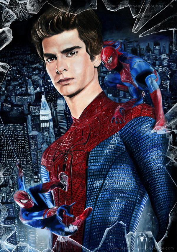
This is Andrew Garfield as Peter Parker, the new Spiderman. I'm very looking forward to the movie!
  (Smile)") I drew the poster with Prismacolor and acrylic and used some different reference pictures for the drawing.
I drew the poster with Prismacolor and acrylic and used some different reference pictures for the drawing.
The reference for the glass fragments: archaii.deviantart.com/art/Sha… by
Oh and these are my most heared epic music scores while drawing this: www.youtube.com/watch?v=JN25hb… and www.youtube.com/watch?v=HlzQUF… by John Dreamer. They don't let me give up in the face of all the details.
edit: Saw the movie yesterday (July 2nd). You have to watch it!! It's just "amazing"! No really, it's an awesome movie. In my mind, the best Spiderman movie yet.
---
Tools:
Prismacolor pencils
acrylic
White pigment ink
Size: 43x61 cm
Paper: Fabriano Artistico
Time: approx. 60 hours
Become my Patron!
Done!
This is Andrew Garfield as Peter Parker, the new Spiderman.
The reference for the glass fragments: archaii.deviantart.com/art/Sha… by
Oh and these are my most heared epic music scores while drawing this: www.youtube.com/watch?v=JN25hb… and www.youtube.com/watch?v=HlzQUF… by John Dreamer. They don't let me give up in the face of all the details.
edit: Saw the movie yesterday (July 2nd). You have to watch it!! It's just "amazing"! No really, it's an awesome movie. In my mind, the best Spiderman movie yet.
---
Tools:
Prismacolor pencils
acrylic
White pigment ink
Size: 43x61 cm
Paper: Fabriano Artistico
Time: approx. 60 hours
*
Become my Patron!
• All New Artworks
• Work in progress pictures
• Longer and slowed down videos
• Real-Time Videos
• [Goal] a monthly raffle for limited art prints
• Besides the raffle, I'm selling specific limited Art Prints only to my Patrons!
• Also, I'm selling specific original artworks only to my Patrons!
• Work in progress pictures
• Longer and slowed down videos
• Real-Time Videos
• [Goal] a monthly raffle for limited art prints
• Besides the raffle, I'm selling specific limited Art Prints only to my Patrons!
• Also, I'm selling specific original artworks only to my Patrons!
*
---
"The Amazing Spiderman" is © Sony Pictures, Marvel, Columbia Pictures
Drawing and composition © by Jeanne Delâge
_____________
Connect with me:
Image size
1054x1500px 1.81 MB
© 2012 - 2024 Jeanne-Lui
Comments145
Join the community to add your comment. Already a deviant? Log In
I think your work is spectacular. Very well done, there is emotion and realism in this poster, everything is noticeable without seeming too clumped or busy. Now on to the hard stuff; your vision is good, but what I don't like is the way the poster is separated into three dimensions. I'm not sure if that's what you where going for, but in my opinion in takes away from the art. The idea to have the two action shots of Spidey is brilliant, but their positioning is awkward and sticks-out strangely. The city and the broken glass go together perfectly, but it doesn't go so well with the your figures. The idea is, again, brilliant and very original, and with just a little tweaking should look great, or, dare I say it, Fantastic (comic buff, that's me). Garfield's face is beautiful, that is just hands down phenomenal technique; because the all around vibe from the poster is "Watch out, epic badass coming through" maybe make the shading a little darker to fit with the background and general feel of the art and he's perfect. Your attention to detail is great, and you proportioned Garfield's body very nicely. All in all, a amazing piece of work, so the council decrees it goes to the favorites.